Thursday, December 9, 2010
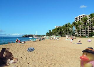
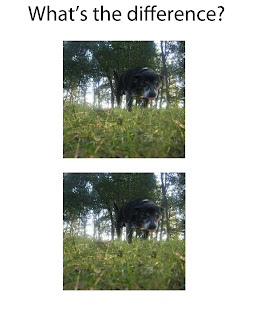
Find the differences!
Everyone went downtown while I stayed in English, so they were doing a scavenger hunt. So I had to use my own personal images. And the project was doing sort of "Where's waldo" thing, but it's just with differences... Have fun!
Some hands.
The effects used were to make the image warm, cool & emerald (with a gradient background). It gives the image a more difference effect and lets it stand out more.
(Warm)
Thursday, December 2, 2010
Photo Aging
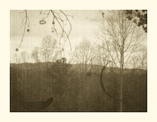
When making a modern picture look vintage, you shouldn't pick a picture that has something modern (i.e. computer, ipod, technology) that is obviusly not old. The brush that I used for this was a coffee stain brush.
Tuesday, November 16, 2010
Typography
Typography is using text and arranging it properly to make a design. I made a star and just used the letters of my name to make my name.
Thursday, November 4, 2010
Wednesday, November 3, 2010
Macro Examples
Macro Photography is taking pictures up close that you are able to see a lot of detail and texture.
Example 1
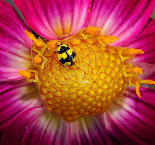 Images fom www.images.google.com
Spooky Picture
Tools Review
Wednesday, October 27, 2010
Midterm Exam =/
For our midterm exam we needed to take two guys out of one picture, place them onto this one "realistically", add a fire hydrant, and remove evidence of a date that was printed on the picture.
(Final Product!)
Tools used: Quick Selection tool, Magnetic Lasso Tool, Refince Edge tool, Duplicate layer, Paint brush, Gaussian Blur, layer masks, and cloning.
Sounds fun?
Color Correcting!
While everyone else went on the trip to Carter's Mountain, I was stuck in AP English :/
So, I ended up taking my own pictures at home and color corrected them as shown below :)
(Color Corrected #1)
Wednesday, October 13, 2010
Visual Puns
Visual Puns are illustrate a double meaning with the word....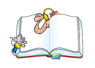 ^^ Book Worm ^^
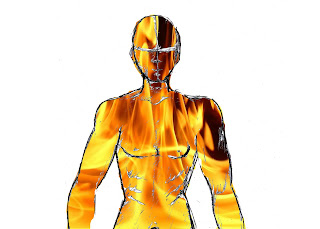 ^^ Fire Man ^^
(Pictures via www.images.google.com)
 ^^ Book Worm ^^
 ^^ Fire Man ^^
(Pictures via www.images.google.com)
Tuesday, October 12, 2010
Pop Artt Exampless
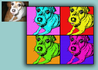
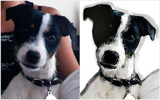
Pop Art is a visual art movement that uses elements of pop culture and uses techniques from commercial art and advertising. You're basically transforming a picture you took into a cartoon.
(http://www.julieartworks.citymax.com/i/photo to art/Jack-Russel-pop-art-2W.jpg)
(http://www.julieartworks.citymax.com/i/photo to art/Jack-Russel-pop-art-2W.jpg)
(http://popartcanvas.com/images/logo-header.gif)
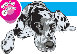
(http://www.fotofix.com/pricing/images/large/pet_2.jpg)
Rule of 3rd's Exampless
The Rule of Thirds is visually seeing that the picture is divided into thirds horizontally and vertically, so that you have nine equal parts. This helps lead the eye into a specific point.
Wednesday, October 6, 2010
3rd Kaliedascope
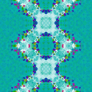
Here's a third picture with the kaliedascope effect.....
(Original Picture)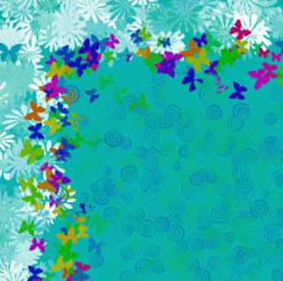
(Original Picture)

(Kaliedascope Effect Picture)
photoshop:)
Same as the other two, so look at previous posts.
Monday, October 4, 2010
2nd Kaliedoscope
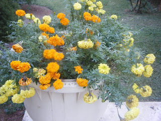
This is Kaleidoscope #2
(Original Picture)
(Original Picture)
 Kaleidoscope effect :)
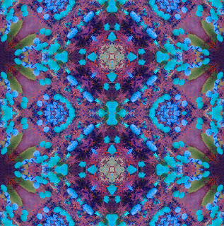
*Same tools used as previous post*
Friday, October 1, 2010
it's a kaliedoscope!
Ok, so we had a shooting assignment and among these pictures I took, I took one of my necklace and was assigned to make it into a kaliedoscope.
(Original Picture)

&& The kaleidoscope version of this is.... 
photoshop:)
Tools used included the Rectangular Marquee tool, Transform, Crop, Merge, Duplicate, Flip Horizontal and Vertical, and adjusted Hue Saturation.
Subscribe to:
Comments (Atom)


